State of Colorado Accessibility Newsletter - August 2024

Accessibility News
Upcoming conference opportunities
As summer begins to wind down, a new season emerges - conference season. Several opportunities are on the horizon for learning, networking, and participating in robust discussions with our partners in accessibility. Many of our colleagues across the state are on the agenda to present at each event and we can’t wait to see you there!
- Colorado Digital Summit: At the summit in downtown Denver on Sept. 12, OIT’s Technology Accessibility Program (TAP) Manager Karen Pellegrin will present “Bits and Bytes - Using Tech for the Greater Good”, a fun and informative session that will also be a powerful reminder that it is everyone’s job to understand how to create accessible government websites, services and content.
- SIPA 12th Annual User Conference: The Statewide Internet Portal Authority (SIPA) User Conference will be at Coors Field in Denver on Sept. 23 with a number of accessibility-related sessions on the agenda. Karen Pellegrin, Abi O'Neal from the Department of Personnel Administration, and Aidan Stowell with the Office of Judicial Performance will present on “Accessibility Lessons Learned and What To Do Next.”
- Government Innovation Colorado: The event in downtown Denver on Oct. 8 is focused on employees in the public sector and covers improving process, digital accessibility, managing data, recruiting and retaining new generations of talent, and aligning and upgrading technology. Karen Pellegrin will present on “How to Create an Accommodation Plan, Lessons Learned and Processes.”
Accessibility and You
Google Sites: Color contrast
By Beckie Bean (she/her), Accessibility Consultant
At TAP, we get a lot of questions about website color contrast. This month, we will review how to ensure your Google Site theme uses colors that have sufficient contrast. If you would like more information about the color contrast requirements, review WCAG Success Criterion 1.4.3: Color Contrast Minimum (Level AA).
Before we get started, we want to remind you to check with the necessary stakeholders and approvers in your organization before changing the theme colors on your Google Site. Let’s get into it! Here is how you edit your website theme to ensure your Google Site uses colors with sufficient contrast.
- Click the pencil icon to edit your Google Site.
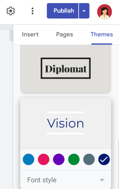
In the editing view, there is a panel to the right of the content view. Select the tab option for “Themes.”

- Select a theme from the options provided by clicking on its name. Please note that your organization may have a specific theme that you should use. Contact your communications team for more information.
- Once selected, a palette of color options will appear. Select a color option that has a color contrast ratio of at least 4.5:1 with the background color.
- Not sure how to determine color contrast?
- Click on a color and its HEX code will appear (e.g. #001970)
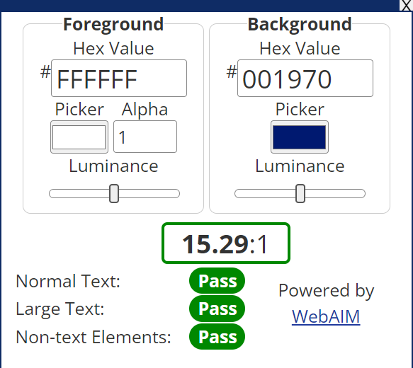
- On another tab/window, navigate to a color contrast checker. We use the WebAIM Color Contrast Checker.
- Enter the hex values of your colors and it will display the contrast ratio.
- Not sure how to determine the HEX code?
WebAIM also has a bookmarklet that you can add to your browser!

- Once added, you can click on it and it will pop up on your screen.
- To access the eyedropper tool, click in the box under “Picker” and then click on the dropper icon.
- Using the eyedropper tool can take some finesse, so be patient with yourself if it takes a little bit of effort to click in just the right spot to capture the color.
- Once you select your foreground and background colors, the color contrast will appear in the window that opened when you selected the bookmarklet. You will know you have selected colors with sufficient contrast if it says “Pass” for normal text, large text and non-text elements.
- Please note that browsers have not yet implemented accessibility support for the eyedropper tool within color inputs.
If you have questions about color contrast or other accessibility-related issues, reach out to your organization’s accessibility or ADA coordinator.
Chelsea's Corner
Audio descriptions or: How I discovered a love for action flicks
By Chelsea Cook (she/her), TAP Accessibility Consultant
I like watching movies and television shows. Some might find this surprising—hopefully most people still find it normal. Because I am blind, movies and TV shows are much more enjoyable thanks to one important accessibility feature: audio description.
Audio description (sometimes called video description or descriptive video) is the process of including a separate audio track to video content where a narrator will describe the important or essential visual elements on screen. This could include anything that visually helps tell the story, like spicy romance scenes, car chases, animals in the wild and gunfights. Audio description is more an art than a science, as it requires scripts written specifically to be inserted carefully around the regular dialog and sounds. Sometimes this feat is not easy, as the recent Olympic events demonstrated. (While they did have audio description, sometimes the describer had no choice but to talk at the same time as the standard commentary.) This can also have unexpected cinematic effects, such as when an explosion is announced by the describer a few seconds before it actually happens.
There is one genre of movie I hated before the wider availability of audio description but I now love: action movies. The first action movie I saw with description was Gone in 60 Seconds. While some say it's not one of Nicholas Cage's best performances, this movie will always hold a special place in my heart because it's the first movie where I actually got to experience the thrill of the chases and car heists. I've now seen it so many times with description that if I watch it without, I can usually remember most of the descriptions.
Culturally, there is a difference between American and European description tracks. Though Europe usually has more audio-described content than the U.S., their descriptions tend to be more concise and less detail-oriented. The "art" part can also come in handy when describing a movie with technical content. There are two descriptions out there for the movie Top Gun. If you listen to the original one recorded in 1986, they will use aviation terms like "full 360-degree roll" when describing the aircraft maneuver. Newer descriptions will just say "turn". I like the old ones better, but I understand that those terms could be jargon. To me, they make the experience much more authentic. Some blind people who previously had sight don't think the descriptions convey the full range of experiences. Describers do have to make decisions on what to omit by nature of the video art form.
Some of my friends with cognitive disabilities loved the descriptive track once they got used to it. They likened it to listening to an audiobook and the presence of visuals also helped expand their vocabulary when the narrator would speak.
Another accessibility win is how audio description can be independent from other accessibility features if the platform allows it. I remember thinking it was the coolest thing ever when a friend (who needed captions at the time) and I rented the Minions movie from iTunes. Since the rental included both audio description and caption options, we turned them both on and were able to enjoy the movie together.
If you want to try out audio descriptions yourself, it is available on most modern streaming platforms (Apple TV+, Netflix, and Disney+ are pretty reliable creators). When you are on a program content page, there is usually an AD icon that indicates if the content has audio description. The whole catalog of film and TV hasn't yet been described, but most modern titles are. So sit back, close your eyes, listen, and let the canvas of your imagination fill with words!
And remember: blind people like movies, too.
Accessibility Quick Tips
Indicating a document type within the link
When presenting formats within links on webpages and other document types, be sure to add the document type within the link instead of outside the link. For example:
- Continue writing links with the format inside the link: Recommendations for State Websites (Sheets).
- Discontinue writing links with the format outside the link: Recommendations for State Websites (Sheets).
This enables the format to be read along with the descriptive link text when scanning through links with a screen reader. This recommendation is also followed by the U.S. Web Design System as well as some academic design systems that have thoughtfully integrated accessibility into them. Here is more information from the OIT website on creating accessible links.
Notable & Quotable
“Disability is not something an individual overcomes. I’m still disabled. I’m still Deafblind. People with disabilities are successful when we develop alternative techniques and our communities choose inclusion.”
- Haben Girma, author of “Haben: The Deafblind Woman Who Conquered Harvard Law”
